Finding The Flow For PharmacyX
Synopsis: PharmacyX’s mission is to develop great technology solutions that empower patients and maximise the efficiency of community pharmacy operations. PharmacyX frees up pharmacists and their teams to focus on excellent patient care with smoother processes, paperless workflows and patient self service.
Challenge: PharmacyX is a unique proposition as the UK’s only pharmacy software provider that also operates pharmacies. They needed a brand that would emphasise their understanding of the role of community pharmacies, and their struggles to compete with emerging technologies, without alienating larger businesses from their Enterprise offering.


Insight and idea: We wanted to create a visual system that was flexible enough to appeal to the different scales of their target customers, that would capture their relationship to community pharmacies and the people they serve, but also the robustness and innovation of their technology platform and app.

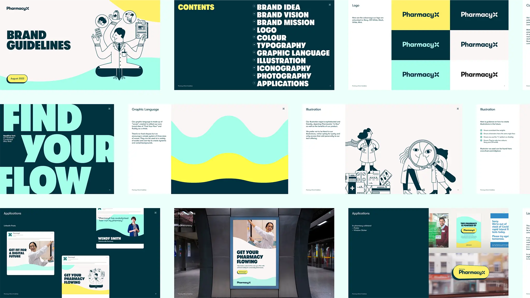
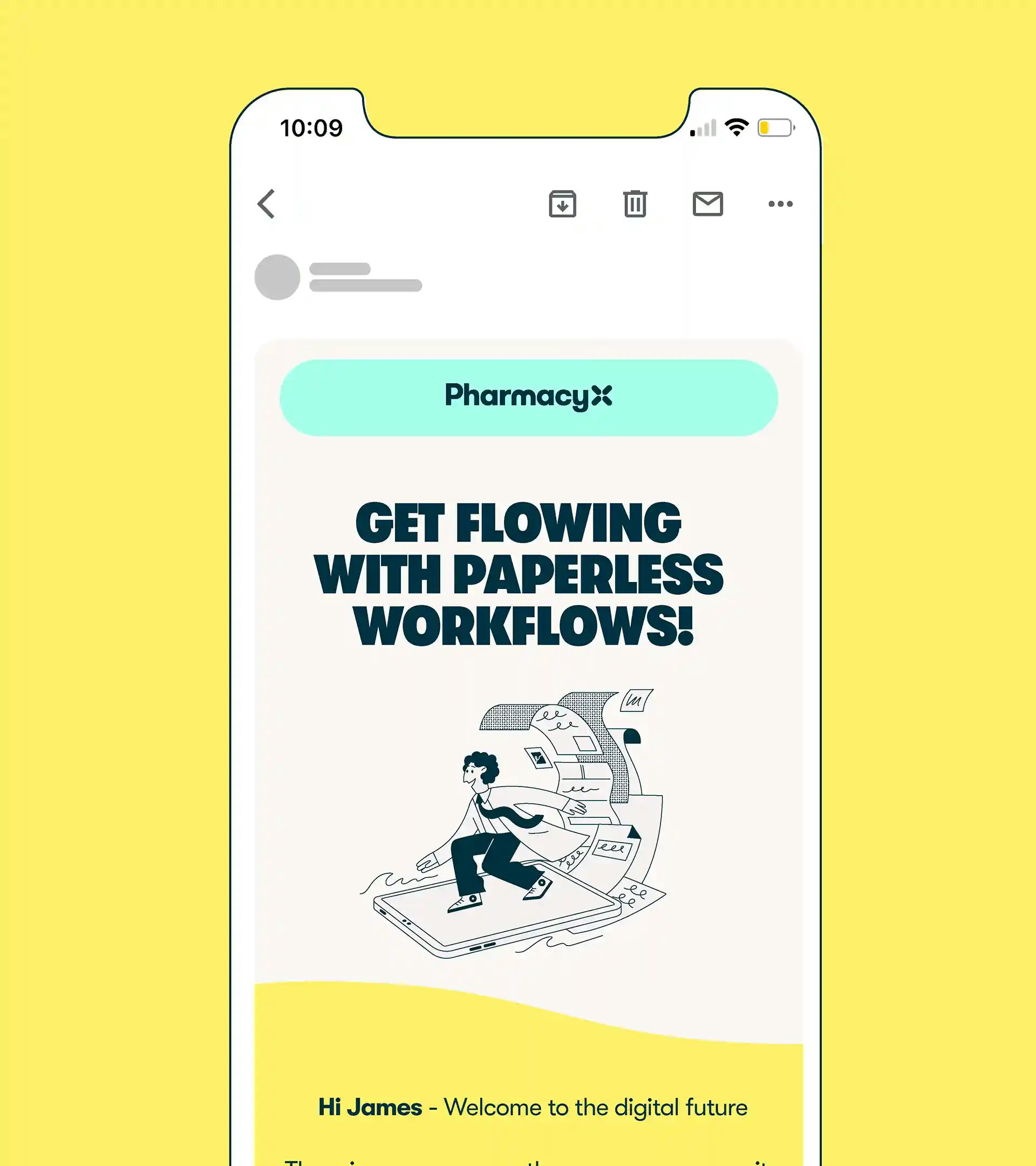
Expression: Our core brand idea of ‘Find Your Flow’ was conceptualised to represent how the software impacts the working life of customers – out with the chaos and in with the calm, streamlining processes and encouraging flow.
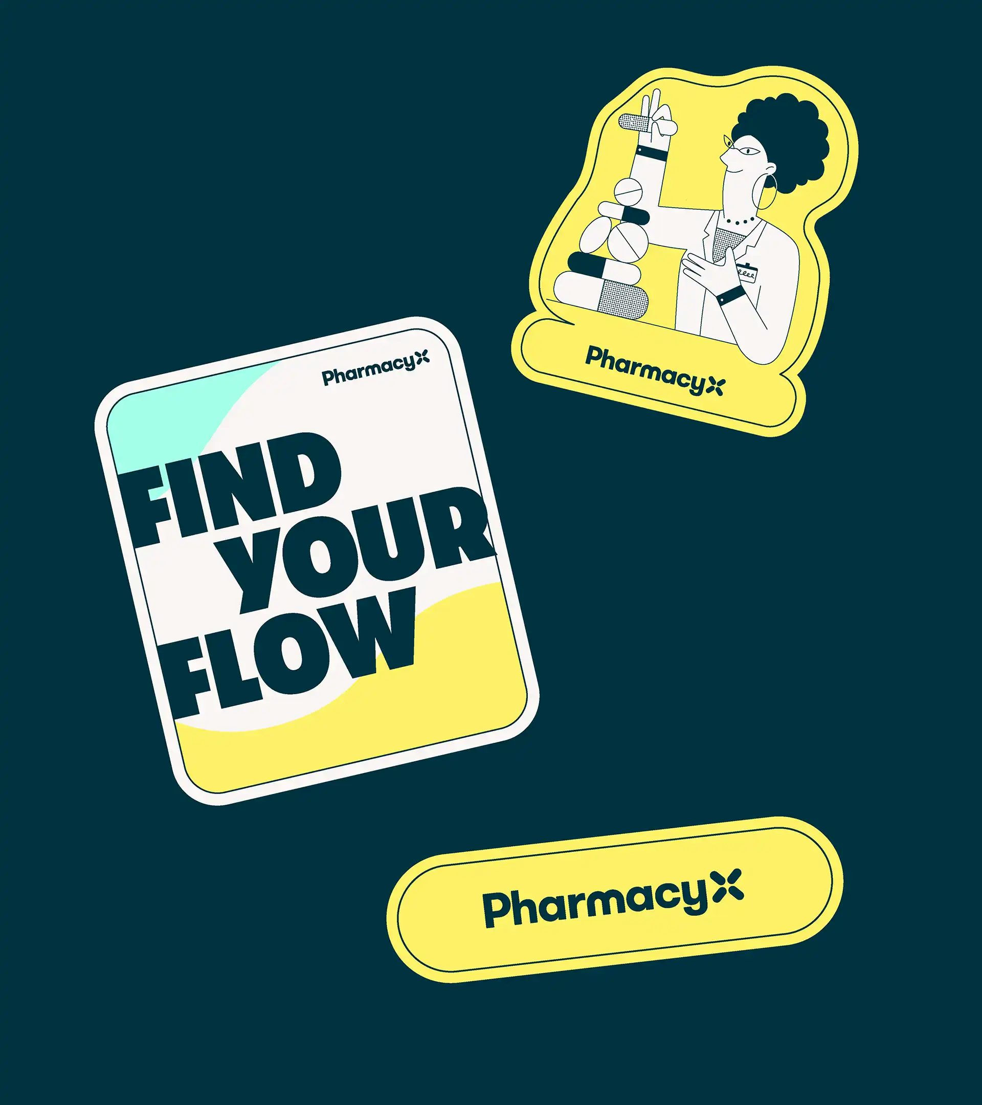
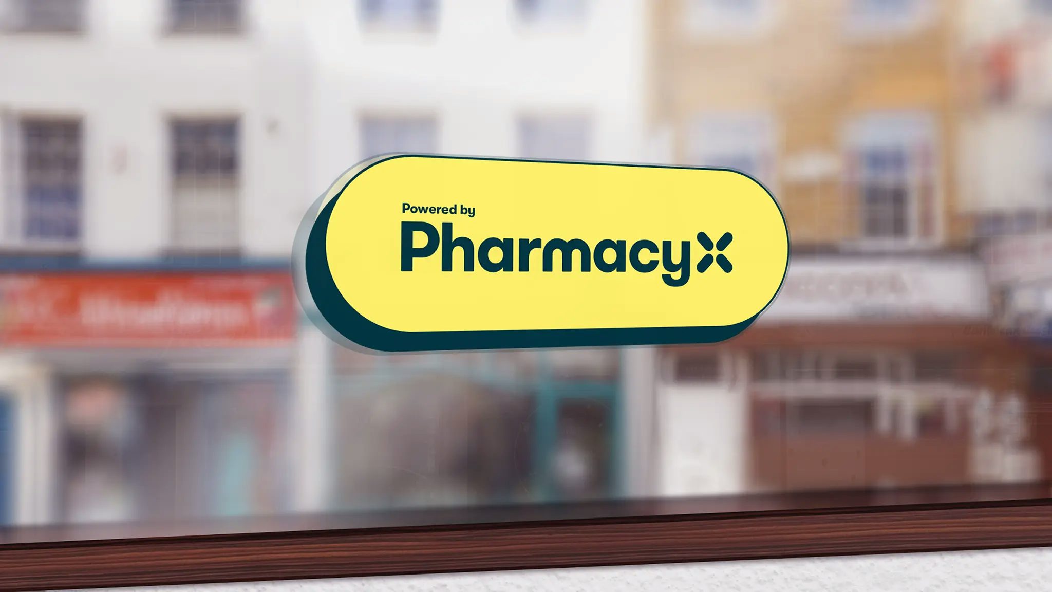
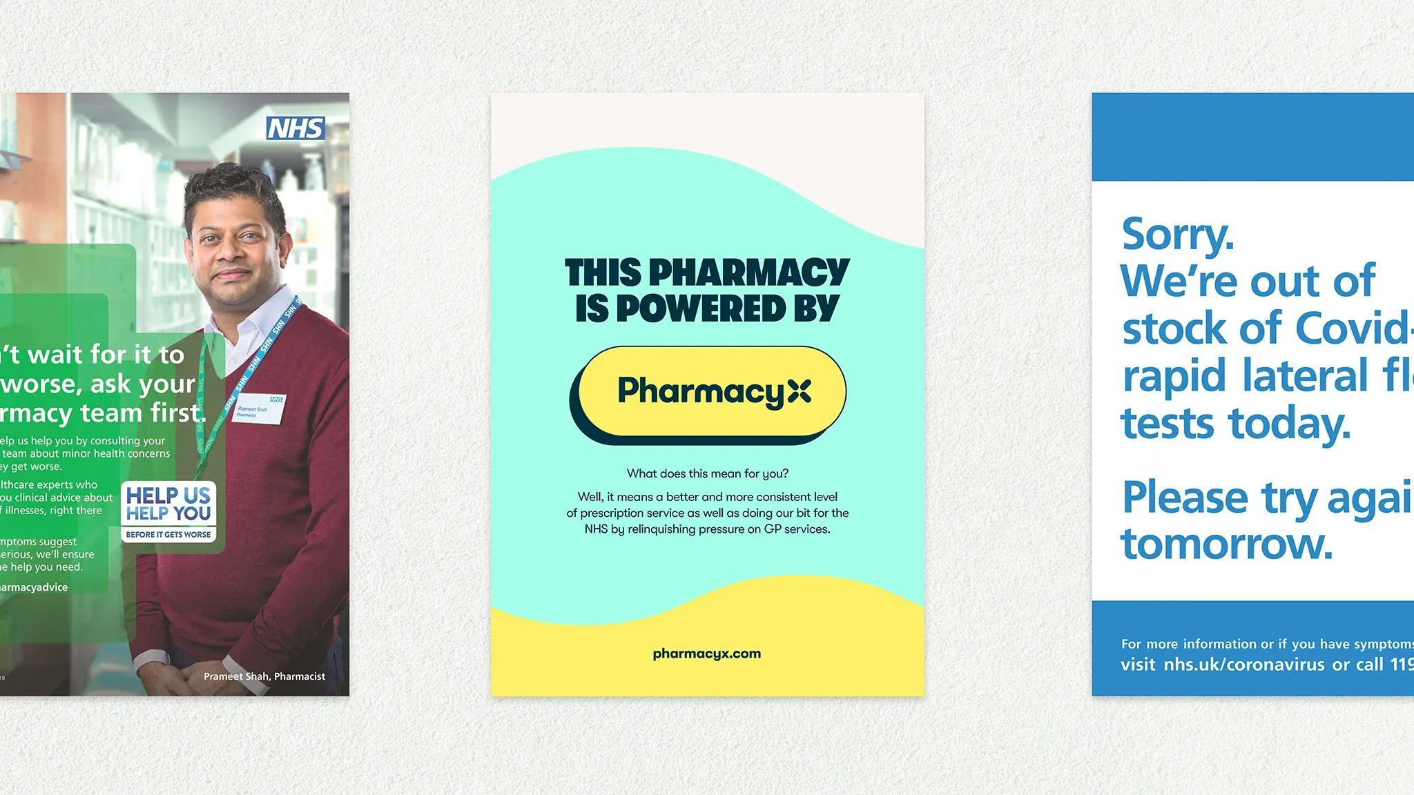
A new visual system of colour, logo, typography, photography and illustrations combine to create a sense of fluidity, calmness and personality. The logo ‘X’ is created by uniting four pill shapes, reflecting the core focus of our product – medication. A simple and harmonious colour palette reflects warmth and personality.
Mint is inspired by the colour of prescription paper, with yellow for a sense of optimism. Off white adds warmth, while navy helps ground the palette with a complementary contrasting colour. Bespoke illustrations are sophisticated and friendly, depicting pharmacists ‘in flow’, while simple rounded icons reinforce the fluidity within the identity.